Ethinos
CLIENT: ETHINOS
A minimal identity system built for a data-driven marketing agency.
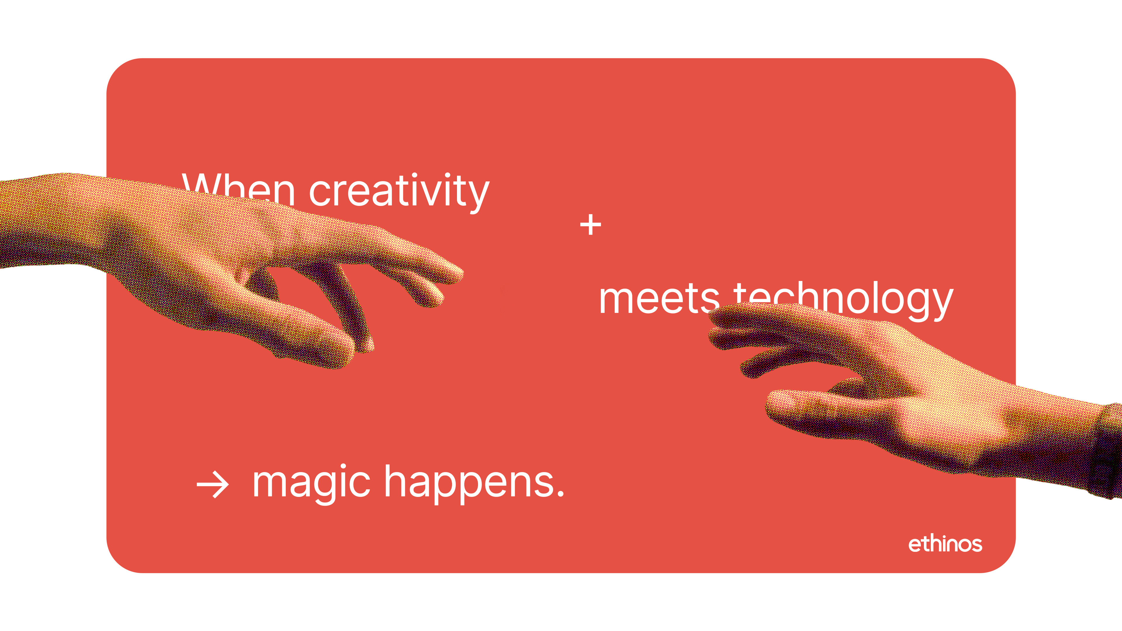
For Ethinos, I led a complete visual rebrand to modernize the agency’s identity and align it with its core philosophy of combining creativity, media, and technology. Ethinos operates as a performance-focused digital marketing agency working with brands across industries such as healthcare, finance, and consumer products. The challenge was to evolve the brand into something that reflects both its analytical foundation and its creative capabilities. The rebrand focused on developing a clean, flexible identity system centered around clarity, modularity, and digital adaptability, allowing the brand to function seamlessly across modern product surfaces and marketing environments.


Brand System
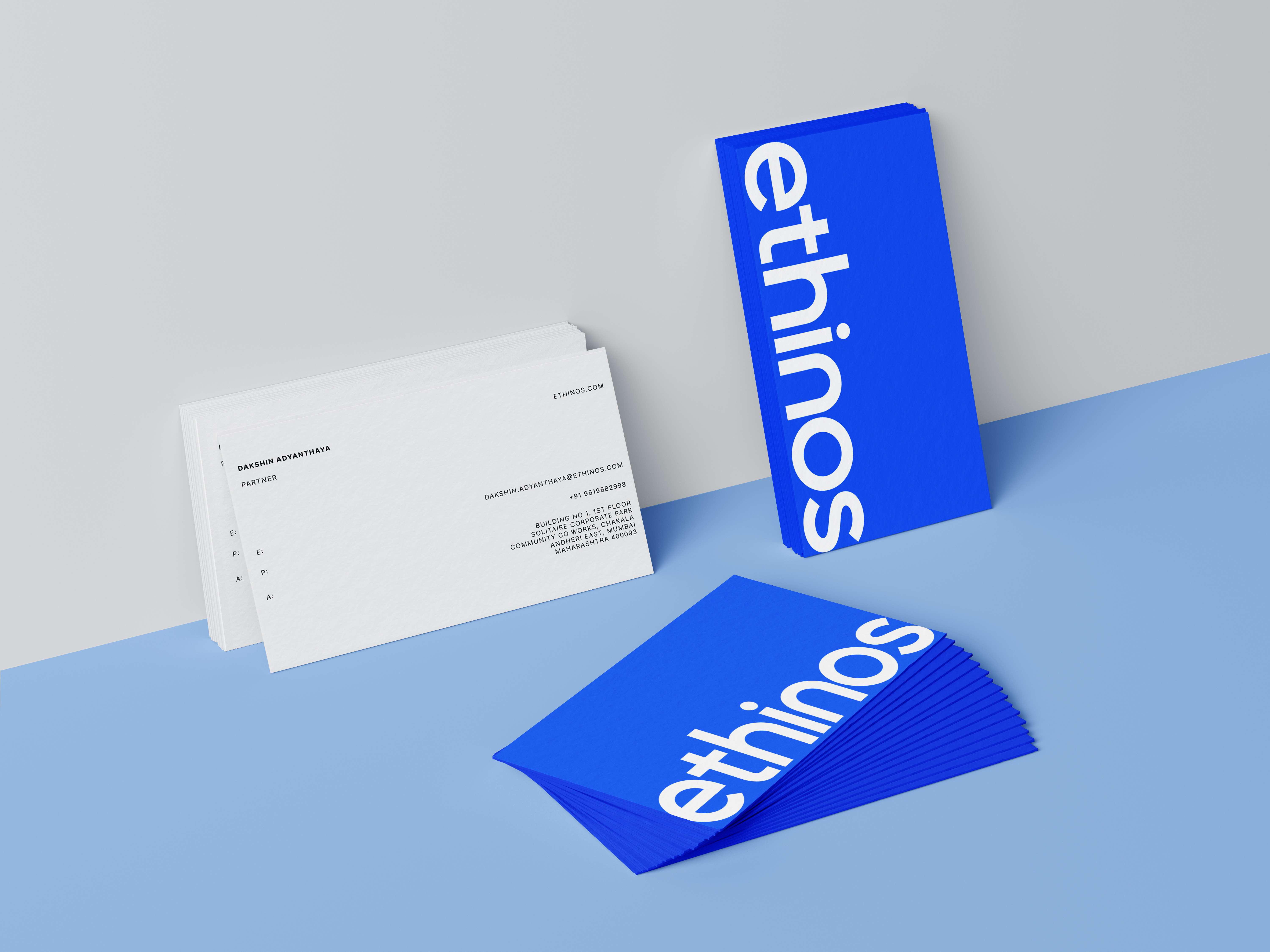
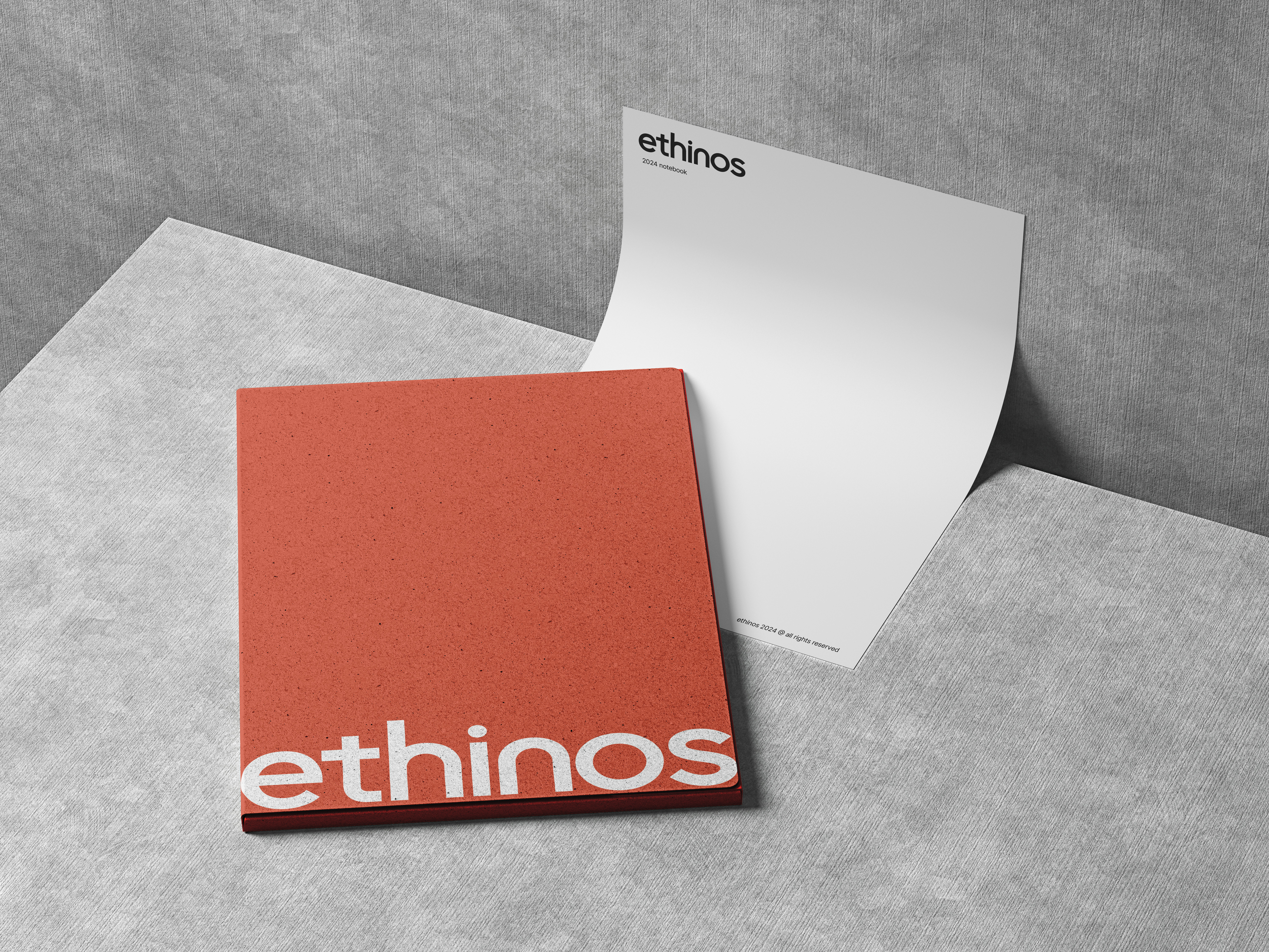
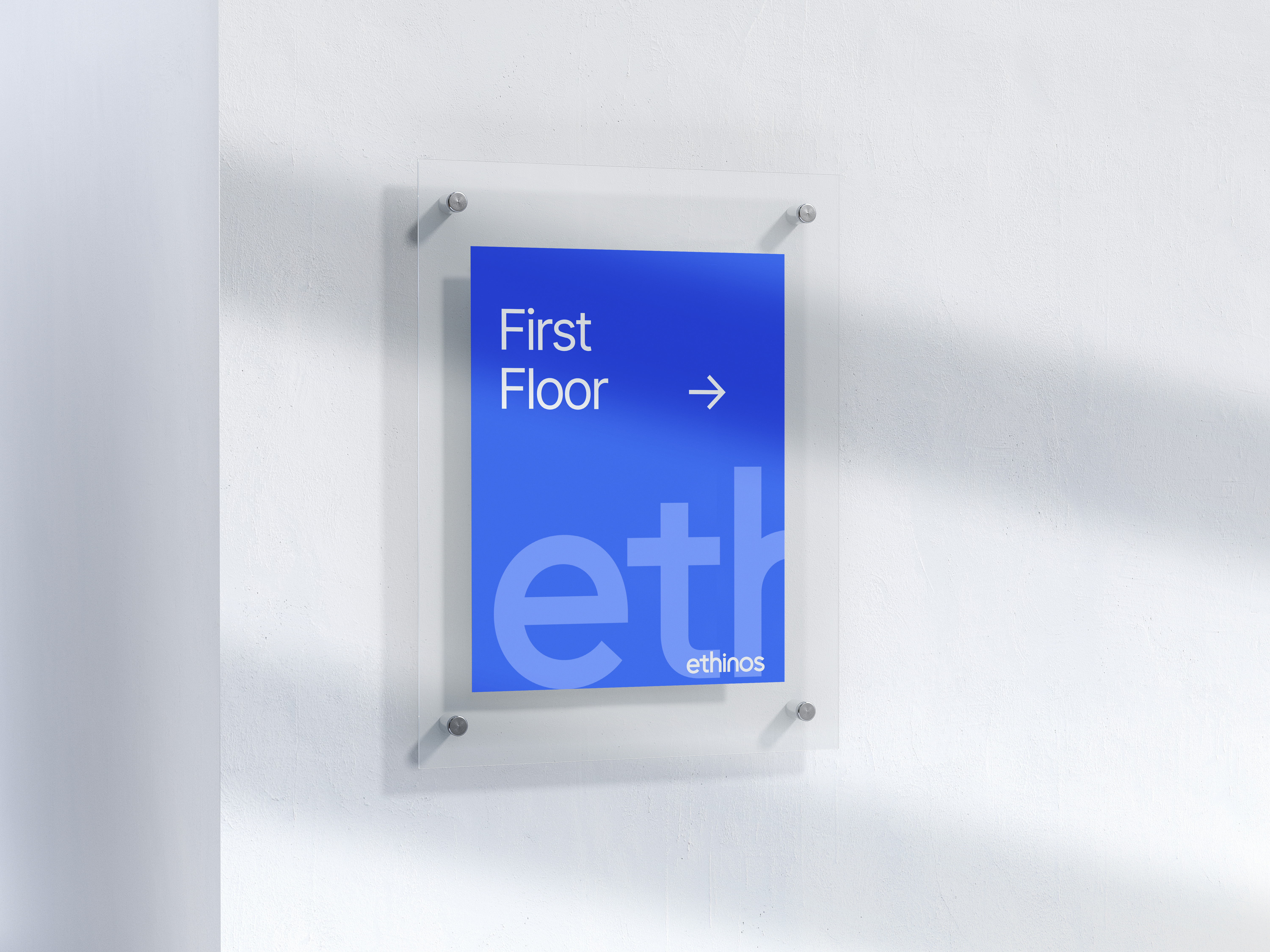
The rebrand centered around a refined typographic identity anchored by a simplified Ethinos wordmark. The system was designed to feel modern, direct, and highly adaptable across digital contexts, ensuring clarity across interfaces, campaigns, and brand communications.
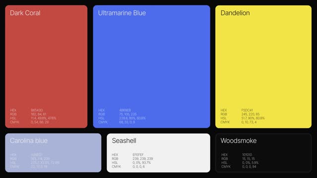
Color Architecture
The identity introduces a dynamic color system built around primary spectrum-inspired tones. Each color represents different pillars of the agency’s ecosystem—creativity, technology, and media—allowing the brand to flex across multiple contexts while maintaining a consistent visual structure.
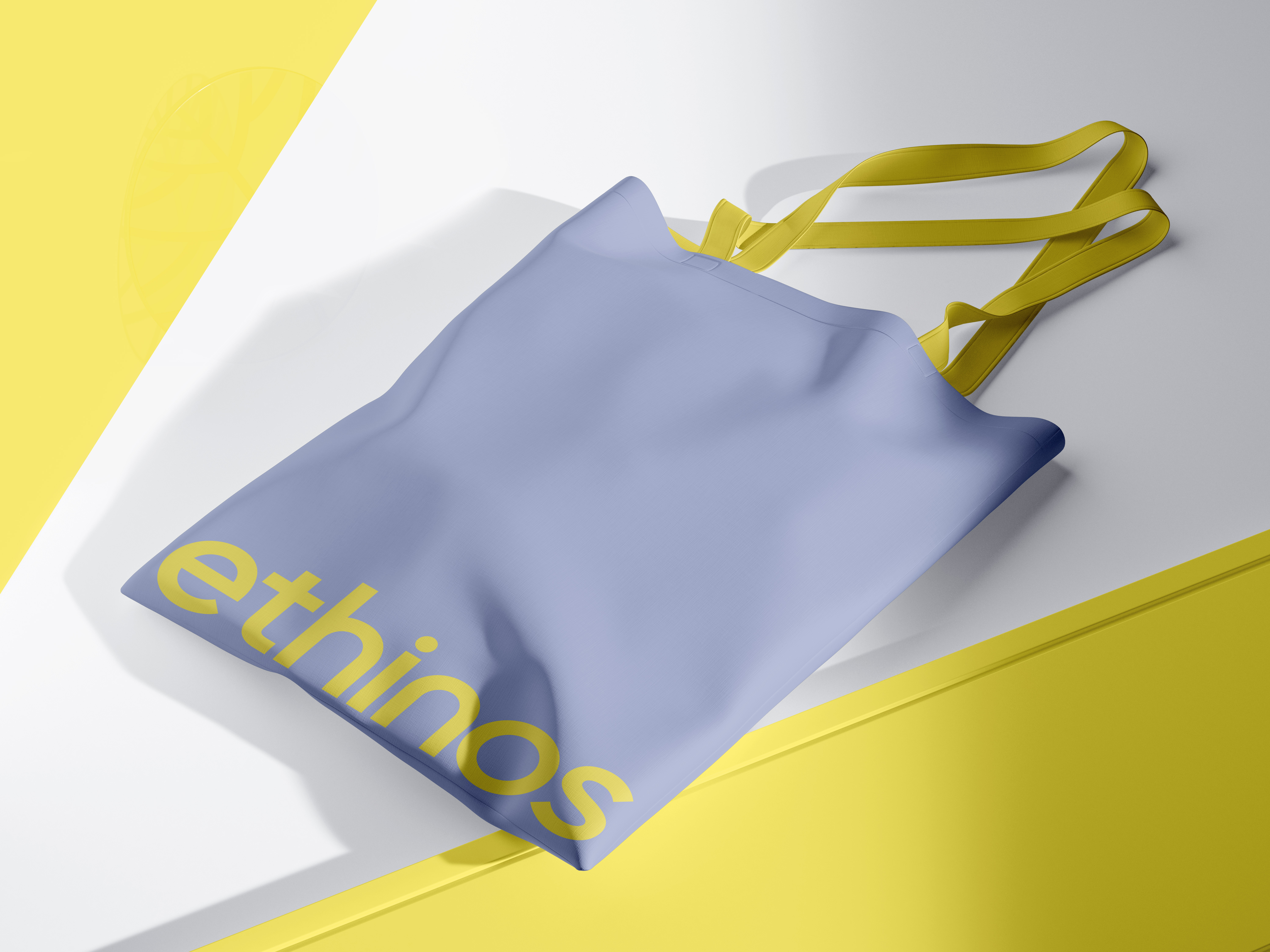
Digital Applications
The identity system was designed with a strong focus on modern digital surfaces. From social media formats to marketing collateral and product visuals, the design language emphasizes modular layouts, bold color fields, and adaptable brand assets that scale across different platforms.


Brand Identity — 2024
Ethinos